Integrations
Custom Card
Acquire integrates with many third-party applications to make communicating with visitors even easier. Think of Custom Cards as a self-made integration that’s fully customizable. Custom Cards appear in the visitor profile section or the timeline. Depending on how it’s set up, Custom Cards may display data and talk to your internal systems.
In this article:
- What Can I Do with a Custom Card?
- Creating a Custom Card
- Installing the Custom Card
- Editing or Uninstalling the Custom Card
- Sample HTML
To read our developer documentation, click here.
What Can I Do with a Custom Card?
Custom Cards may be used for a variety of purposes. Perhaps you need to keep track of a customer’s loyalty points: a custom card can easily show this in the integrations panel on the Dashboard.
Custom Cards are also great for creating customizable menus.
Best of all, Custom Cards may be used to communicate with your database, sending information seamlessly from Acquire to your servers.
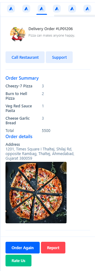
Custom Card example
Creating a Custom Card
To create a Custom Card you may need web development experience, access to the API you are interacting with, and a way to display it, such as an HTML template.
There are many ways to create a custom card. You may use a default template or HTML to render the card. All Custom Cards must have an API endpoint that responds to a GET request and returns a JSON payload.
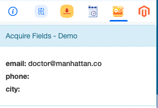
Custom cards pull information from HTML pages or UI components. You will need to specify which parameters you want to pass into the template. For example, you may want to map users by their email addresses. To pass an email parameter, use the syntax {{contact.email}}.
Types of Custom Cards
You may implement a plugin view or thread view Custom Card. Plugin view Custom Cards appear in the visitor profile and integration pane to the right of the Conversation Window.
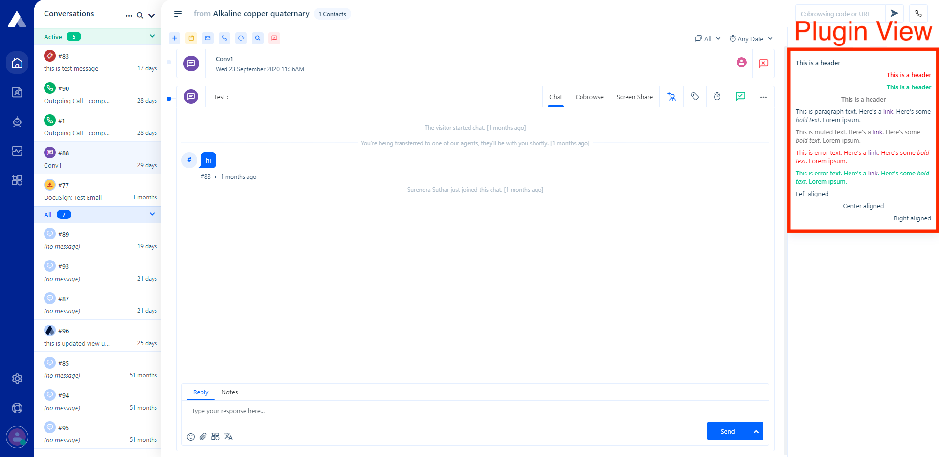
The plugin view displays in the visitor profile and integrations pane.
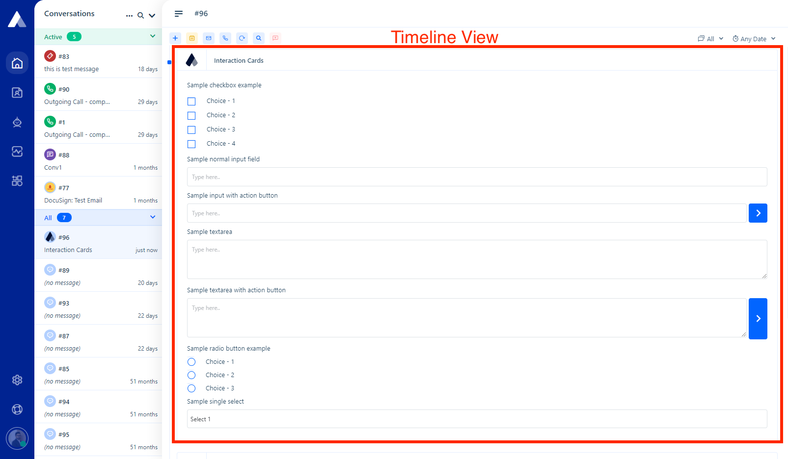
The timeline view appears in the conversation window.
Custom Card Components
Many HTML elements may be part of a Custom Card, including:
- Text
- Image
- Link
- List
- Data Table
- Cards
- Divider
- Spacer
- Button
- Feedback
- Section
- JSON-to-HTML
- Checkbox
- Input
- Radio
- Single Select
- Badge
- Grid
Installing Custom Card
To get started, head to the App Store and select ‘+ Install App’ on the Custom Card tile and authorize access.
You’ll be redirected to the Settings tab.
For a Plugin View card, input the:
- template URL
- authorization header (if applicable)
- either custom HTML or UI component
Thread View is currently in beta. It may not function or may function unexpectedly.
For Thread View cards, input the:
- template URL
- authorization header (if applicable)
When you have completed the inputs, toggle the status to on (right, green) and press ‘Save’.
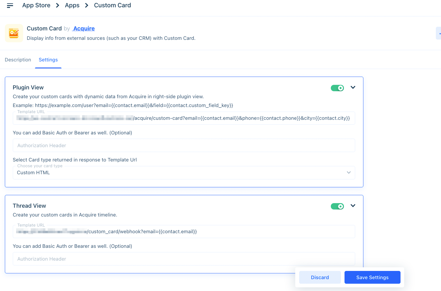
Custom Cards ‘Settings’ tab example.
Editing or Uninstalling the Custom Card
To edit the card, click on the three dots (‘...’) on the App Store tile, and select ‘Edit’. You’ll be redirected to the Settings tab.
To uninstall, click on the three dots (‘...’) and select ‘Uninstall’. The application will be uninstalled.
Sample HTML
This HTML code shows a sample of a template URL. The {{contact.email}} and {{contact.country}} represent an API call. The template URL for this page would be https://example.com/?email={{contact.email}}
Custom Cards may be used for a variety of purposes. Create powerful connections with your visitors and internal systems by integrating with Custom Cards.
Was this article helpful?


